CASE STUDY
Conducting UX Audit
For a Connected Product Ecosystem
Company
Monarch Tractor
Role
Product Design Lead
As the product matured, it became clear that a strategic UX audit was needed to evaluate the full digital ecosystem, to define principles that would guide future product development and scaling.
THE CHALLENGE
With new features rapidly evolving across multiple platforms, inconsistencies in usability, interaction patterns, and visual design began to surface. The complexity of managing EV fleets, setting up autonomous operations, and monitoring real-time tractor data demanded a clear and unified user experience.
We needed to:
Identify usability issues across platforms
Define UX principles for a complex, data-rich environment
Create a clear framework for design consistency and future improvements

Platforms
iOs, Android, Web
Moving too quickly created inconsistencies across the digital suite
THE PROBLEM
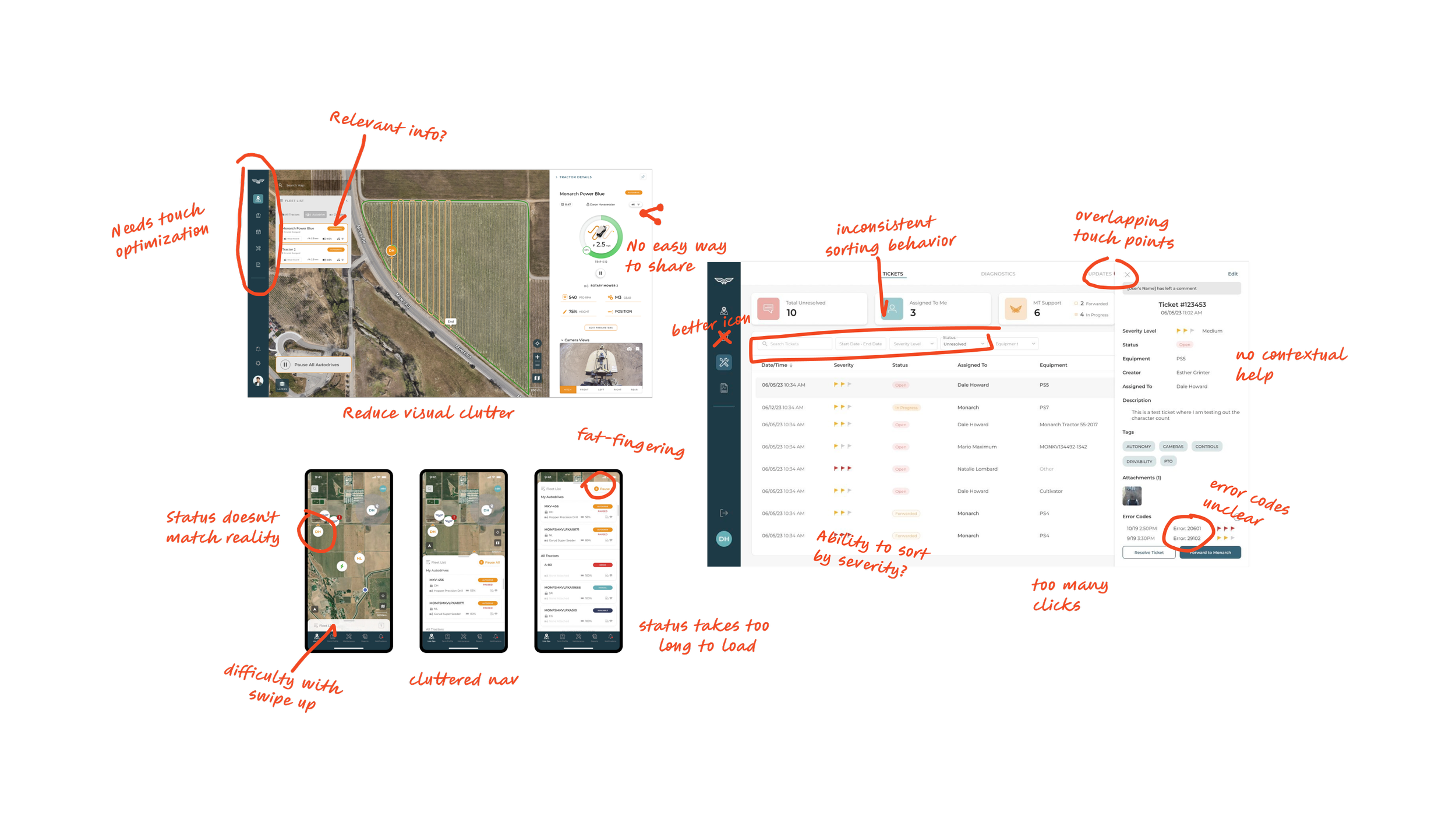
Users were experiencing cognitive friction when moving between different platforms and features. Each feature had unique design patterns and terminology, making workflows like setting up autonomy or tracking fleet health feel disjointed and inconsistent.
🚩 USER PROBLEM
💡 SOLUTION
I developed a heuristic and UX guidelines document that served as a north star across teams as we conducted our audit. The framework outlined best UX practices and design guidelines, as well as business incentives and priorities. This directly improve cross-platform consistency and gave engineers and PMs a shared language for user-centered design.
A misalignment of business incentives and shifting priorities created inconsistencies in messaging, interactions, and protocols throughout the digital ecosystem. This diluted the brand and made the product seem unreliable.
🚩 BUSINESS PROBLEM

My Approach

Heuristic Principles & UX Guidelines
Before the audit, I created a well-defined UX guidelines document that included:
10 core heuristic principles tailored to our unique use cases
Do/Don't examples of interactions based on real screens
Guidance on information architecture, progressive disclosure, and control visibility
Accessibility and touch-target standards for tablet and mobile use
Recommendations for responsive behavior and scaling
This framework became a key reference for the team, not only guiding the design of complex, multi-step workflows, but also serving as the foundation for developing robust usability testing plans and maintaining design cohesion across platforms.

Comprehensive UX Audit
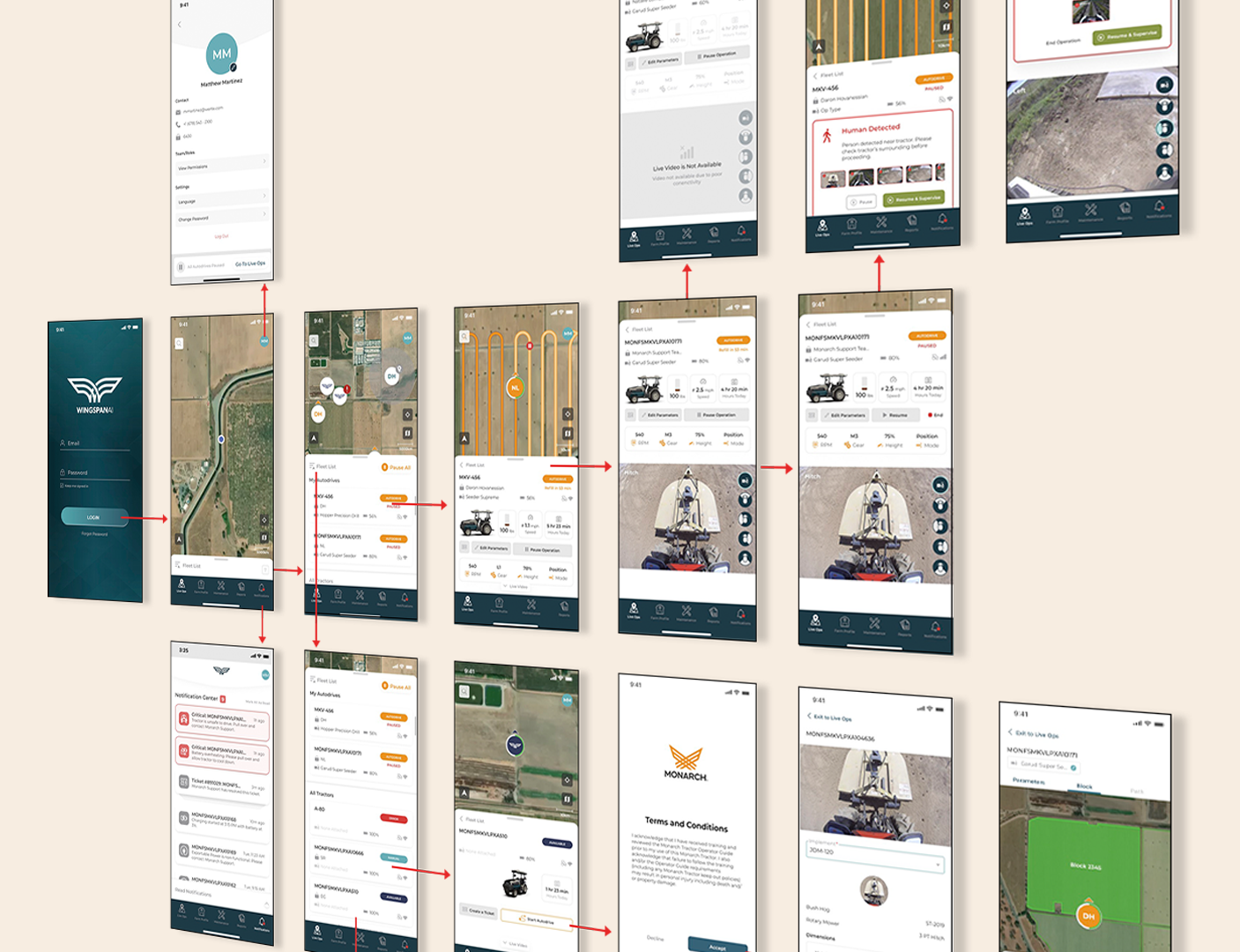
I led a team to perform a screen-by-screen audit across:
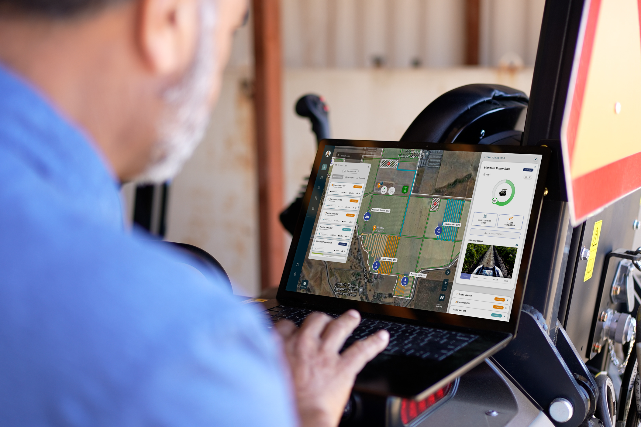
Mobile App (iOS/Android) – Used for fleet control, autonomy, and real-time alerts
Tablets – Making sure both web portal and mobile apps are responsive and touched optimized.
Web Portal – Accessed by fleet managers for planning, analytics, autonomy and diagnostics
We mapped out key user journeys across all platforms and identified pain points using heuristic evaluation methods—focusing on areas such as clarity, feedback, consistency, error prevention, and flexibility.
We also combed through each feature and product, making sure the interaction and designs were consistent with the defined UX standards.
Following Industry Standards
I based our heuristics standards on a set of usability heuristics introduced by the Nielsen Norman Group.
Visibility of system status
Match between system and the real world
User control and freedom
Consistency and specific standards
Error prevention and forgiveness
Recognition rather than recall
Flexibility and efficiency of use
Aesthetic and minimalist design
Help users recognize, diagnose, and recover from errors
Help and documentation
Goal
Streamlining Navigation
🚩 USER PROBLEM
Users struggled to complete core tasks due to inconsistent navigation patterns, buried actions, and unclear labeling.
💡 APPROACH
Assess and improve the app’s navigation, which had become cluttered and unintuitive as features were added during rapid growth. The audit aimed to identify usability friction points and deliver actionable design recommendations to improve user flow, efficiency, and satisfaction.
📈 Task Analysis
Mapped top user flows to understand how navigation impacted efficiency and error rates.
USER TESTING
Validating with Real Users
Conducted moderated user testing with internal operators and early external partners using revised designs and clickable prototypes
Captured task completion success, comprehension of autonomy flows, and satisfaction scores
Iterated on interaction patterns and labeling based on test insights
Usability Testing Reinforced Our Investigation
Observing real users interacting with a live interfaces
revealed how users behave, while auditing explained why the issues occur and how to fix them.
The UX audit improved the product and created clarity, trust, and collaboration across teams.
Outcome
✅ Improved cross-platform consistency and ease-of-use
✅ Aligned engineers, product, and design teams around a shared UX language
✅ Informed enhancements to our design system with tested interaction patterns
✅ Accelerated onboarding for new hires and reduced rework from unclear specs
✅ Aided in writing testing scripts for product validation
Impact
The recommendations audit unified the experience across all platforms, enabling faster product iteration and stronger adoption in the field. It provided a scalable design foundation for Monarch’s growing ecosystem, while significantly improving clarity and trust in the tools our users depended on daily.
To comply with my non-disclosure agreement, I have omitted and obfuscated confidential information. All information is my own and does not necessarily reflect the views of Monarch Tractor.